Introduction

Branding is like origami.
Just a blank piece of paper unless you know what to do with it.

-

-
-
-
-

-
-
-
-
-
-

-
-
-
- Community Development
- Business Development
- Real Estate Development Consulting
-

-

-
-
-
-
-
-
-

- The Lehigh Valley Charter High School for the Arts
- Charter Arts
-
-
-
-
-
-

-
-

-

-

-

-
-
-
-

-
-

-
-
-
-
-
-
-
-

-
-

-
-
-
-
-
-
-
-

-
-
-
-
-

-
-
-
-
-
-
-
-

-

-
-
-
-
-
-
-
-

-
-
-
-

-
-

-

-
-

-
-
-
-
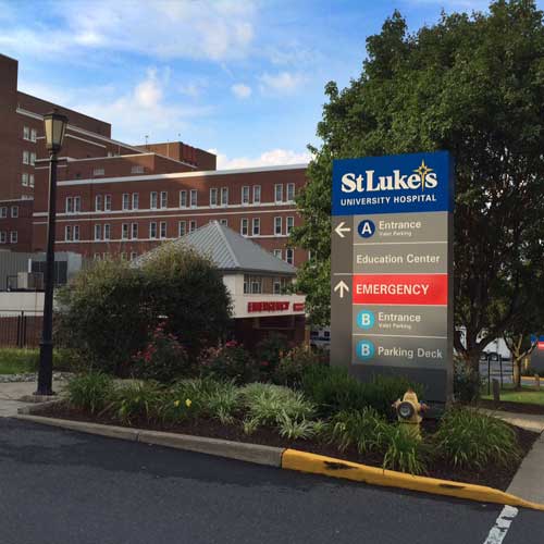
St. Luke’s Hospital
St. Luke’s University Hospital is a regional critical care hospital and healthcare network based in Bethlehem, Pennsylvania.
A new logo which St. Luke’s Hospital had commissioned from another design firm quickly revealed serious problems after it was introduced.
We were hired to rescue the situation. The hospital’s urgent instructions were to “change it without changing it” — quite a design challenge!
Our work was meticulous and entailed a very careful, letter by letter, line by line, point by point, surgical deconstruction and complete reconstruction of the graphic, correcting its errors while properly retaining its concept and developing its character.
We had to go to an extreme level of detail to change it without changing it. We remain very proud of this work. Read the Case Study for a blow-by-blow description of how we did it.
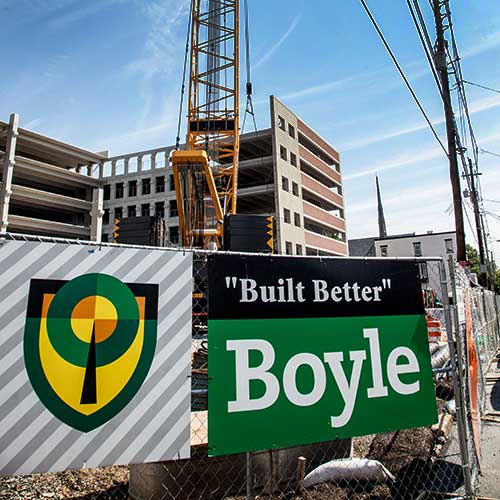
Boyle Construction
Boyle Construction grew from a commercial construction contractor to a successful general contractor to a respected construction manager and needed their branding to reflect their regional market position.
This corporate identity concept is derived from the image of an oak tree on a shield, the traditional Boyle heraldic emblem. It artfully conveys the proud heritage of this family-owned business while its highly stylized treatment imparts an appropriate business posture and architectural feeling, effectively connecting meaning and value.

Phoebe Ministries
Phoebe-Devitt Homes is a regional network of convalescent, assisted living, and senior living homes with a long and venerable history.
The now-you-see-it-now-you-don’t quality of the cross symbol at the center of the graphic makes an especially satisfactory solution for an organization which, although church affiliated, is completely non-discriminatory in its admission policies. Phoebe also values the basic humanitarian sense of caring which the symbol otherwise conveys with the quilt-like interlocking heart motifs.
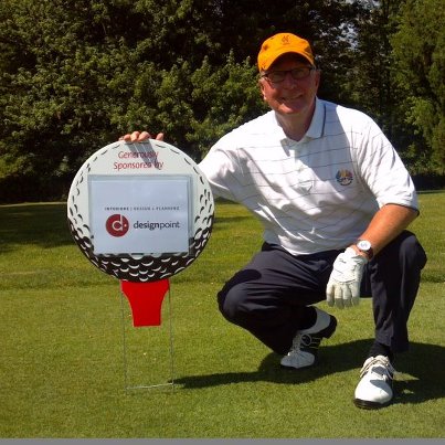
DesignPoint Interiors
DesignPoint is a well-established and successful commercial interior design firm which is looking to stay that way. While seeking help updating their website, they discovered it was time to entirely rethink their brand. It became important for their image to be fresh, engaging, and relevant—qualities they recommend for their clients’ interiors.
With their recast branding, DesignPoint is positioned to pursue their strategy of expanding into newer, larger, and more sophisticated markets.
As with good interior space planning, the new mark, which we named the d-pointe (pronounce it very French!), is based firmly on tried-and-true geometric principles. The d-pointe is based on two perfect geometrical figures: the circle and the golden rectangle. Perfect geometric forms, like all those based on the golden ratio, have been traditional favorites of interior designers, architects, and graphic designers. The lowercase ‘d’ within the logo, the position of the floating dot, and the position of both elements together with relation to the circle, are all governed by the same mathematical principle and thereby achieve harmony.
Logo Love
In its first public appearance, Les McCoy, president of DesignPoint, introduced his new brand on the DesignPoint-sponsored green.
The Swain School
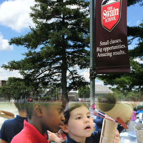
The Swain School maintains a fine tradition of excellent education since 1929 for children pre-school through middle school. Sayre Design created this mark for a milestone anniversary year to capture that legacy and point the way to its future.
It was a simple idea to use the shield heraldic reference to indicate the worthy character and longstanding reputation of the school, to which we added the more unique bright burst at the top of the shield. This energetic element highlights the forward vision of the school and communicates a sense of fulfillment of educational promise.
Ashton Funeral Home
The Ashton Funeral Home is one of the oldest, continuously operated, family-owned funeral homes in America. In business since 1847, over five generations of Ashtons have served the Easton community. They commissioned Sayre Design to update their company image and establish a web presence in their market, in which the family has a very high profile. In an increasingly competitive field, they needed a more consistent marketing message.
Our challenge was to update a brand whose heritage is a main feature, to preserve that venerable identity and establish a new look — old within new, classic poise and contemporary appeal. With some astute choices of typestyle and rendering, we created branding that fosters the sense of assurance and abiding trust key to the Ashton identity, as meaningful now as one-and-three-quarters centuries ago.
Sayre Design created a brand identity vocabulary of several elements: a typographic logotype, an emblem, a symbol-and-type signature, and a horse-drawn hearse silhouette graphic, all drawn to seem as if they might have always been that way, but also to seem as relevant as ever.

Panama City Beach Rugby
Meet “Cyclo”, mascot for the Hurricanes of Panama City Beach, Florida.
Ever play rugby? It’s a sport for the hardy, or the foolhardy. Depends on who you ask. It’s also described as a sport meant for hooligans but played by gentlemen, as opposed to soccer, meant for gentlemen but played by hooligans. Who knows? Everyone understands the gritty, gutsy character of rugby, though.
So, the team traveled north to Sayre Design to design a new brand identity for their club. We divided the assignment into two parts: an identity for the on-field athletic aspect, and a different but related identity for the social club aspect — you know, the pub part.
We created and named Cyclo to represent the athletic aspect based roughly upon the meteorological symbol for a hurricane, but animated him with plenty of personality. He’s sharp, forceful, vigorous, energetic, suitable in all the ways you need a good athletic team logo to be. He’s also a bit of a pun, you see — eye of the hurricane, cyclone, cyclops (single eye).
Well, tough one about those hard yards, fellas. But at least you look the part.
Panama City Beach Rugby Football Club
Okay, here’s the pub part. Well, the club part, actually.
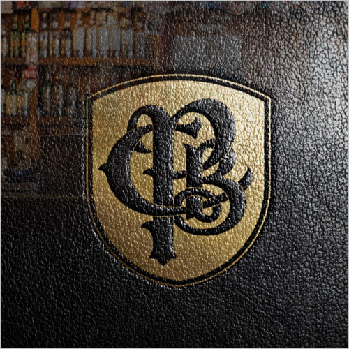
Rugby folks are quite social and like to play hard at keeping good company after they play hard on the field. They maintain tight bonds that are symbolized in rather traditional ways, so that the more formal, traditional treatment of a monogram and a heraldic sort of emblem feels very comfortable and customary to them. Likewise, their formal name is Panama City Beach Rugby Football Club. They like to emphasize that. They also note their founding date. They like all this formal, old-world style athletic affiliation stuff. For rugby, it all works.
Their new PCB Rugby Football Club emblem plays quite nicely along with Cyclo, their new sport logo.
Sláinte! Raise one for us, too.
Bonsall Shafferman
Bonsall Shafferman Architects and Space Planners wanted a brand identity that better expressed the quality of their work and reputation.
Bonsall Shafferman is very stylish. The firm has a solid image in the business community and the construction and real estate industries as one of the premier firms in their market, especially regarding interior architectural space planning and design.
Our logo design conveys these things quite well. It is somewhat playful, conservative, experimental, and rigorous at the same time. It suggests design and planning, uses tastefully vibrant colors, a little Bauhaus here, a little post-modern there, and effectively employs the mathematical and aesthetical qualities of the golden section, that ancient rule of proportion so fondly regarded by architects past and present.
We were taken by surprise when the client architectural firm (them) also asked the brand design firm (us) to design a particular architectural feature of their own architectural office. Imagine that! We marveled at our architectural firm client’s curiosity and confidence, but we wasted no time and embraced the challenge. We got right to work on the collaboration.
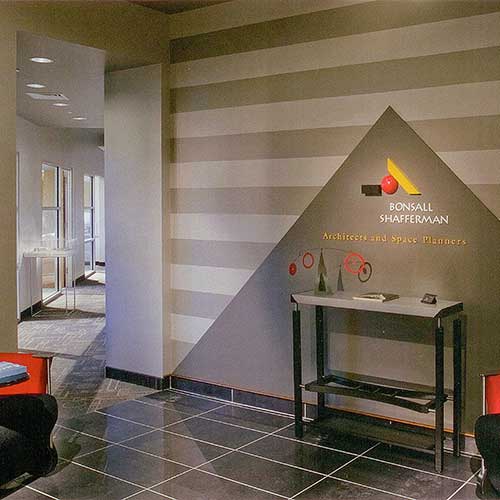
The resulting design of the Bonsall Shafferman reception foyer wall features a three-dimensional rendering of the logo fixed to the wall amid a pyramid mortise and stripes pattern introduced as supporting elements for the extended brand identity program. We nailed it.
Architects are cool.
Hildy’s
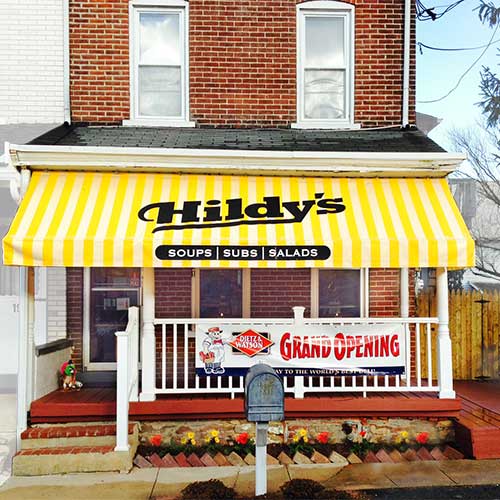
The Lehigh Valley needed another good deli and caterer, but one where you could get delicious Jersey-style subs. Hildy’s was inspired to put together a first-rate operation. They also wanted to make sure that their branding got the point across, too, so they hired the pros.
“It’s all good.”—Hildy
Hildy’s came to Sayre Design and said, “make a logo as good as our slogan.” As simple as it looks, we worked really hard to get the typography just right: one part boardwalk, one part downtown, one part ballpark. It’s strong, gregarious, clean, with a hint of retro Americana. We supported it with the yellow/white stripes as an extended branding motif on packaging, signage, menus, ads, etc., and later translated it to the actual entrance awning.
We think we nailed it and so did they. A tasty brand identity design.
Yumm.

Educators Risk Management
Universities and colleges are complex environments for managing risk. It’s a difficult area to master and higher educational institutions often need the help of experts in these matters.
Educators Risk Management has the depth of knowledge and experience required and wished their brand identity to convey substance and critical competency. On the other hand, ingenuity of their solutions can distinguish such experts from each other, competitively. We sought to design both notions.
Our logo design suggests frameworks for disciplined problem solving, matrix for analyzing data, and an arrow accent for bold ideas and alertness for opportunity.
A simple graphic statement for a sophisticated business which requires both out-of-the-box as well as in-the-box thinking.

Five Paths Yoga
The founder of this yoga studio and therapy practice was inspired by a youthful pilgrimage to the Himalayas, so that mountains are very meaningful to her. Big mountains.
Sayre Design combined ideas related to the five paths of traditional yoga disciplines. The mandala-like quality suggests the fascinating patterns of wisdom and practice that can be traced through history and personal experience, and which seems a common sensibility among people attracted to yoga. In it we see five mountains, five paths, one mountain, one path, five-one-many interconnectedness. The design does not shy away from these deeper notions about yoga while at the same time seeking an accessible appeal, like the single snow cap thrown in for whimsy.
Five Paths Yoga students are encouraged that “yoga is for everyone” and like a breath of (big) mountain fresh air, this brand identity combines ideas of physical health, mental well-being, and spiritual growth with an attitude of accessibility.
Emmaus Main Street Partners
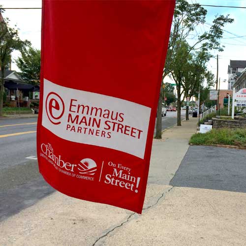
Associated with the national Main Street Program, this lively civic organization wished to solidify its position in the community with a name change and a fresh look. They changed their name to ‘Emmaus Main Street Partnership’ as a better expression of its true function and value to the community. Sayre Design was hired to create a new logo.
In the course of our research we noticed a pattern in the language of people describing the wonderful things that happen “at Emmaus”.
Exploring ideas about business and communications with the organization’s role in economic development, we zeroed in on the @ symbol from email signature syntax. That led to what we dubbed the ‘eeyat’.
The ‘eeyat’ effectively merges ‘e’ for Emmaus with the @ symbol. This struck an interesting note — energetic and solidly based in modern communications vernacular. We thought it’s forward attitude was spot-on what this organization wished to achieve with its recast brand.
Hailstone Economic
Hailstone Economic is a consultancy integrating three closely related but usually separate civic development disciplines:
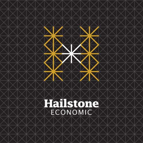
Our preliminary research produced a rich variety of references such as maps, blueprints, traffic diagrams, site plans, etc. Combined with ideas about communications networks, resources, referrals, and organizational charts, we recognized that the central concept of Hailstone’s business is the connectedness of the varied resources and opportunities which produce alliances and solutions for economic development.
It was pretty cool to discover a way to fashion a conceptually spot-on and distinctive ‘H’ out of all that.
Union Local No. 375 — International Brotherhood of Electrical Workers
The local electricians union wanted to establish a clearer local identity, especially within the business community.
We worked out several ideas.
First, we ironed out the clean and easy language “The Lehigh Valley Electricians Union” to affirm the local meaning, and combined it with a new logo graphic to serve as a simple and effective identifier. This was intended to relate to the local civic and business communities.
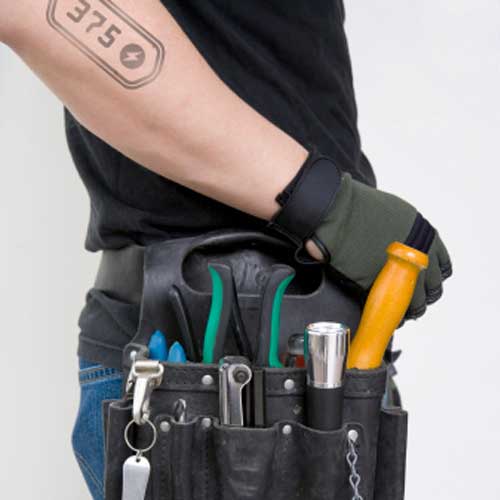
Then we extended the brand identity to create an informal, almost tribal, identifier for the members themselves. These guys take a lot of pride in their trade and in their Union Local No. 375 membership — and make effort to display it — including tattoos.
So, in addition to the new community oriented logo signature, we also designed a derivative logo for them, just for their fraternal use, which we dubbed the “dogtag”.
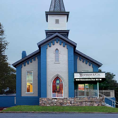
Werner & Co.
Werner & Company is a full-service accounting firm who needed their visual identity to better communicate their professionalism and capabilities.
The firm’s founder is no ordinary accountant-type, however, so it was also important to inject a little graphical spice into the visual solution. The special qualities of the firm are inspired by his own interesting, imaginative personality — augmented by his propensity for hot peppers — suggested by the red accent mark, which also references digital literacy, accounting symbolism, etc.
You can visit them at their historic new home, a renovated old church building in Wescosville, Pennsylvania, or their website www.wernercpa.net which we also designed.
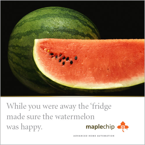
Maplechip
Maplechip Advanced Home Automation is a cutting edge technology startup in a burgeoning business sector. Home automation is a culmination of digital, wireless, and cyber technologies — and a leading example of the emerging ‘internet of things’.
Still in the early rounds of raising venture capital, they know they need a first-rate brand identity from the beginning in order to attract the necessary interest to enter a very sophisticated, highly competitive market. Having thought of their clever and memorable name themselves, Maplechip asked Sayre Design to design a brand identity to match it and excite the enthusiasm of venture capitalists and early adopters by conveying a best-of-class poise.
Watch out, Nest.

CodeMaster Inspection Services
KNOW THE CODE
That’s the mantra at CodeMaster Inspection Services.
CodeMaster needed branding that would immediately set them apart as leaders when the Commonwealth of Pennsylvania opened a new market for private, commercial construction inspection service businesses.
Sayre Design created the name CodeMaster, designed the logo mark, and composed the tagline, all together as a well-formed package to launch the enterprise — and CodeMaster hasn’t look back since. They hit the ground running, gained leadership position quickly, and have dominated their market. Shows what can be done when you “know the code”.
We thought about decoder rings, too. Just for a moment, but, nah.
McDermott Communications
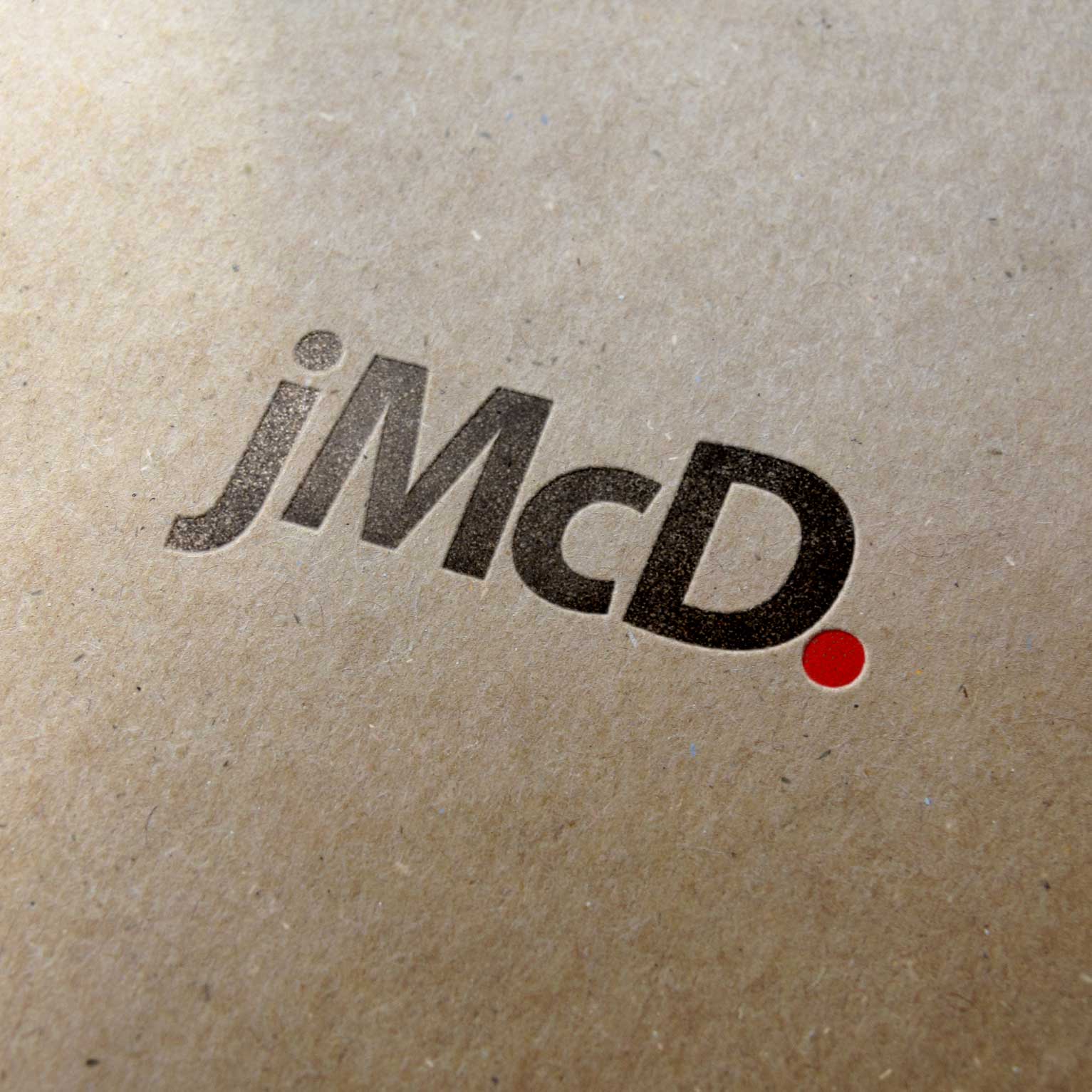
Joe McDermott is a strong writer with a journalism background. He invariably finds the pith of his client’s story and crafts an efficient way to tell it. Sayre Design was commissioned to do something likewise, to create an extraordinary brand identity that communicates like him, like good writing. Clear, complete, to the point.
The coolest thing of all about this brand identity is how ideally form follows function. McDermott’s brand identity is defined by the very means by which he delivers his work — keystrokes. It is as verbal as it is visual and vice versa.
There is no art element used as a logo here. And while we are using a particular typestyle (Myriad, because we like it), the “jMcD.” concept is not limited to it. This brand identity is defined by — in fact encoded within — a particular combination of keystrokes, which are available on any keyboard.
We call it “keystroke typography” because it is rendered the same way as any other word on this page. Type lower case j, capital M, lower case c, capital D, period, and you have marked the brand — that simple and pure. If you can manage the period in red, so much the better!

R L Reppert
R.L.Reppert is a specialized contractor, and among the leaders in their region.
Partitions, ceilings, insulations sounds like a simple enough design problem, but give it a try. Not so easy, really, to produce something easy to understand, but also not so obvious as to be boring. Sayre Design created this durable mark and logotype to hint well enough at what they do while also communicating a sense of stature and leadership. The isometric concept of the symbol has a strong architectonic character, so it also conveys the larger scope of the enterprise. The treatment of the initials ‘RL’, which are indeed part of the name, is also not as easy as it looks, and succeeds quite nicely here.
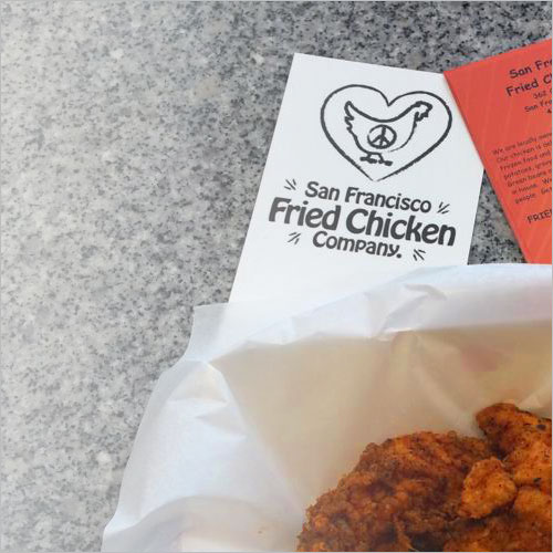
San Francisco Fried Chicken Co.
Well, there you have it.
A hippie-dippie approach to a cool, downscale restaurant neighbored smack dab in the oh-so-hipster Mission district of San Fran. Perfect.
Their motto? “Peace. Love. And fried chicken.”
Did we miss anything?
Reith Geothermal Energy
Reith Geo is a geothermal drilling and loop installation contractor.
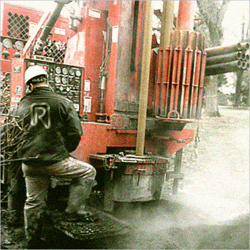
Geothermal is a popular, advanced, eco-friendly alternative energy technology, but the business of the actual drilling, excavation, grouting, looping, testing, rock trenching and so on, is a pretty gritty affair. It’s sort of hi-tech and lo-tech at the same time.
Our brand identity design solution managed to strike this balance nicely, especially the idea of rendering the ‘R’ as a continuous loop — revealing the basic technical concept behind geothermal energy.
And all their trucks are painted red.
Charter Arts
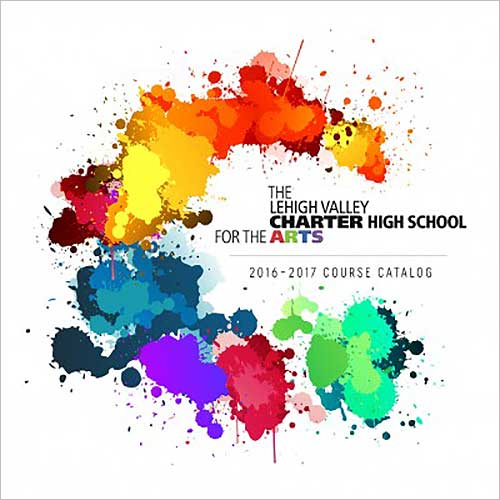
THE LEHIGH VALLEY CHARTER HIGH SCHOOL FOR THE ARTS
Whoa! 9 words/12 syllables/42 letters is a lot for a name.
We had to use them all, so we did, including the word ‘the’ twice. We grappled with this unwieldy name and found a way to make it easy to read both versions — the complete, long form AS WELL AS the short familiar form — simultaneously.
The overall shape of the composed logotype is unusual and maybe seems a little awkward at first. You get used to it pretty quickly, though, because it’s actually good design; it makes sense.
Our analysis identified the component word groupings, noting that their hierarchy does not necessarily correlate with reading sequence. Since there are several spoken versions of the name of this school we needed to find a way to recompose it. That’s a problem, but a problem design can solve. So we did.
We applied a sort of rough logic by freely reconfiguring the positions of the phrase elements, stacking, aligning, extending, etc., and using different styles and weights of typeface to establish the right reading rhythm and emphasis, focusing on two primary* readings:
Finally we added color for personality and deeper concept. Since the school is commonly known simply as Charter Arts, our use of type weight and alignment also highlights this easy, abbreviated reading of the logo as “Charter Arts”, despite the presence of all the other words. It works both ways.
In the end, its unorthodox overall shape actually serves to make the logo more recognizable and memorable. We wouldn’t have guessed that outcome, but design is full of such surprises. Keeps up on our toes and alert for the best solution however we discover it.
P.S. — This would have been even more difficult with a tenth word. Originally the school was named The Lehigh Valley Charter High School for the Performing Arts, however, the idea emerged in our earliest discussions to drop ‘Performing’ from the name for several strategic as well as practical reasons. It was important to more accurately reflect broadened interests, which had grown since the school’s founding, and especially as the school prepared for a major capital building campaign.
* The school had been referred to variously as: “Charter High School for the Arts” “Lehigh Valley Charter Performing Arts” “Lehigh Valley Charter Arts” “High School for the Arts” “Performing Arts” “Lehigh Valley Performing Arts” “Lehigh Valley Performing Arts High School” “LVPA”
J. Dylan Concrete
A new concrete contractor has arrived on the scene, combining old-school craft with new and evolving construction methods. Even concrete construction, which might seem like it never changes, must run with the times. Branding for a concrete company has to seem firm. Strong. But also crisp and sharp.
J. Dylan aims to claim all that in their market and they wanted to look the part right from the get-go. So they called Sayre Design.
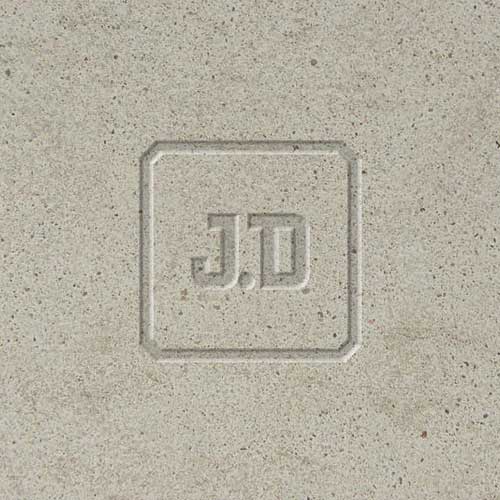
The J.D stamp of quality kinda says it all.
American Custom Homescape
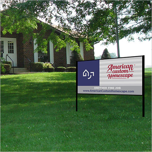
American Custom Homescape combines traditional home remodeling construction with exterior hardscaping.
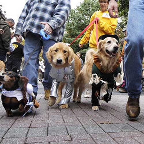
Doggie Day!
Who has more fun on Doggie Day? The canines or their owners or the parade spectators?
Participants in the “Mutt Strutt” parade, in which dogs and their humans alike dress up, is part of the annual autumn Doggie Day! celebration in Bethlehem, Pennsylvania presented by the Downtown Bethlehem Association.
Photo: Donna Fisher/The Morning Call

Green Voltage Capital
Green Voltage Capital invests in renewable energy resource ventures, providing financial support for the most promising technologies and organizations. While their activity is mostly behind the scenes, their presence is increasingly felt in the way these technologies are changing our life and economy.
Green Voltage hired Sayre Design to design them this crisp branding to express their identity as key players in this new and increasingly important financial market. A well designed brand like this helps to open the doors of opportunity with its strong and accurate impression.

Helios Solar
Helios Solar is a local leader in the alternative energy business.
The brand identity from Sayre Design gets a good deal of power from its obvious plug-into-the-sun idea. We also took care, however, to imbue the graphics with conservative taste and and classical refinement to underscore credibility and cast the broadest public appeal.
Musselman Jewelers
Musselman Jewelers is a classic quality jeweler which needed their brand identity updated to reinforce their long-standing reputation as fine jewelers while extending a fresh presence in an evolving retail environment.
The new logo has a jewel-like quality and a nice period charm to it, recalling the store’s founding in 1930 under the sway of the art deco era. The influence is seen here is the handling of the ornately intertwined double ‘s’ letters. The rest of the look is appropriately formal and elegant.
Sayre Design also suggested to the store to take advantage of a new tagline “EST. 1930 Historic Bethlehem” which highlights the era and origination of their commercial roots. Simple enough, but effective and smart.
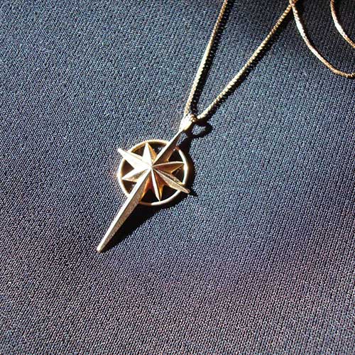
The store also commissioned Sayre to design a centerpiece jewelry item based upon the ‘Star of Bethlehem’ motif popular with local customers as well as visitors to Historic Bethlehem, Pennsylvania.
About Us
Michael and Nancy Sayre are a husband and wife team directing some of the best brand design efforts in our market. Learn how we design with knowledge, experience, skill, and creativity.

