The Mixie Makeup Company

• NEW LOGO • NEW NAME
THE COMMISSION
After years of local boutique service with an indistinct identity, the client wished to launch a more ambitious manufacturing and distribution enterprise. She commissioned Sayre Design to create a properly formed brand identity which would position her enterprise as a premium offering, with enough style power to compete with Clinique and Lancôme at department store makeup counters.
THE NAME
For the company’s new name, we wished to aspire for sassy and cute, memorable and energetic. The name needed to be sufficiently, but not overtly, feminine, because she also carries a line of men’s cosmetics. We also sought to incorporate reference to the idea that her product is custom-mixed. The name Mixie, with its descriptive aspect, accomplishes all of those goals.
THE LOGOTYPE
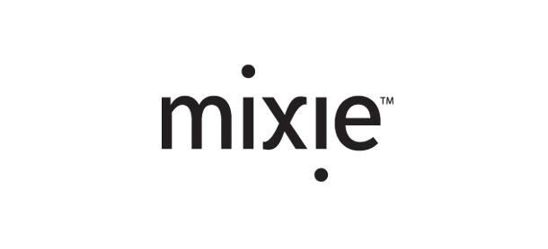
To connote a fresh, up-to-date sense of fashion, we chose to render mixie in all lowercase, modernistic, sans-serif type. We used typography to reflect the palindromic character of the word mixie by emphasizing the play of one lower-case ‘i’ against the other as they cross the middle character (the ‘x’). The inverted ‘i’ letterforms make connective use of the cross stroke of the ‘x’. The slightly-curved character of the other cross stroke of the ‘x’ provides the high style of the mark and a bit of wit and playfulness.