St. Luke’s Hospital
• BRAND IDENTITY • DECONSTRUCTED/RECONSTRUCTED LOGO
THE PROBLEM
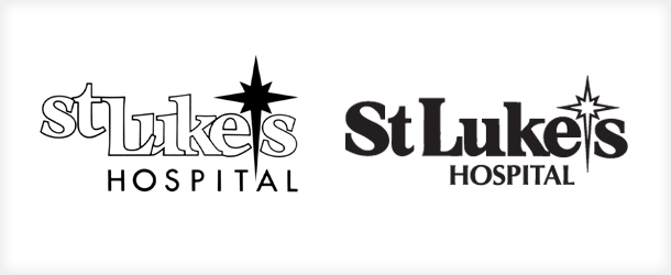
A new logo for St. Luke’s Hospital, designed by another firm, quickly revealed serious problems after it was introduced. The Sayre Design team was hired to rescue the situation. The hospital’s urgent instructions were to “change it without changing it” — quite a design challenge!
THE SOLUTION
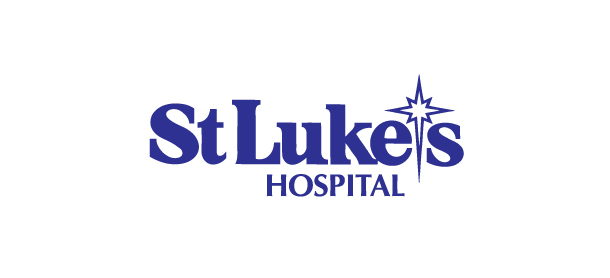
Our work entailed a very careful, letter by letter, line by line, point by point, surgical deconstruction and complete reconstruction of the graphic, correcting its errors while properly retaining its concept and developing its character.
BEFORE AND AFTER

Among the important corrections:
- Separated the jumbled letterforms to restore legibility
- Changed letterforms from outline to solid to create impact and readability
- Positioned ‘st’ on same baseline with ‘Lukes’ to improve coherence
- Capitalized ‘S’ in ‘St’ to better communicate institutional stature
- Re-drew all letterforms, serifs, terminals, and other typographic fine details
- Re-drew every edge, every curve, and every corner of each element of the design
- Reduced the Bethlehem star graphic to remedy its heavy-handed overemphasis
- Corrected star from a heavy/solid to a light/open graphic for truer ‘starlight’ reference
- Appropriately ‘open’ star now suggests ‘light’ on either light or dark backgrounds
- Compacted ‘HOSPITAL’ and changed typestyle for better balance and interest
While making what was worthwhile even better
The original design offered two particular features worth retaining: the quaint Bethlehem-star-as-apostrophe idea, and the stylistic omission of a period from the abbreviation for Saint. However, nearly everything else about the original logo was problematic. Its ineffective readability was exceeded only by its poor legibility and inferior reproducibility. Sayre Design fixed and improved everything about it while keeping its basic look and character. According to the assignment, we “changed it without changing it.”
Happy hospital
St. Luke’s was very relieved by the clean resolution and loved the results. The impression conveyed by the logo was successfully realigned with the institution’s proper identity. The hospital’s high-profile brand identity has since become one of the most recognizable and trusted in its market.
A.B.E Doors & Windows is another example of this type of brand identity problem and solution.
