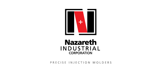
Nazareth Industrial

• NEW LOGO • REFINED TAGLINE
Injection molding is a highly competitive industry, especially for an American company, so Nazareth Industrial wished to increase its emphasis on its technical advantages with a visual identity which effectively communicates strength and precision.
The overall look of the mark strongly resembles the face of a typically massive injection molding die. The specific appearance of the ‘ + ‘ graphic at the center, referring to the actual injection orifice, is something anyone familiar with the industry would recognize — very useful to their critical B-to-B relationships.