Boyle Construction

• BRAND IDENTITY • LOGO • REFINED NAME • REFINED TAGLINE
Boyle Construction grew from a commercial construction contractor to a successful general contractor to a respected construction manager and needed their branding to reflect their regional market position.
MEANINGFUL AND RELEVANT
This corporate identity concept is derived from the image of an oak tree on a shield, the traditional Boyle heraldic emblem. It artfully conveys the proud heritage of this family-owned business while its highly stylized treatment imparts an appropriate business posture, effectively connecting meaning and value.
AN IMPORTANT TWEAK TO THE NAME
Sayre Design persuaded Boyle to substitute ‘Construction’ in their name for ‘Associates’. This name refinement helped to clarify more firmly their market position; no doubt that they are in the construction management industry.
A NEW AND BETTER TAGLINE, HIDING IN PLAIN SIGHT
The previous tagline “Better Built By Boyle” had been effective enough in its time, but the simple b-b-b-b alliteration which made it memorable in the first place began to seem a little awkward as the company was gaining more market share, and higher profile work for more sophisticated clientelle.
The solution was a wonderful exercise in preservation of equity and good editing. Sayre teased it apart for examination. We deleted ‘Boyle’, deleted ‘by’, and transposed ‘better’ and ‘built’. ‘Built Better’ was now free to associate in an obvious way with the Boyle name in the logotype. For the market who remembers the old tagline, the now-missing ‘by’ still resonates with the same b-b-b-b alliteration now operating by implication. For new ears in the marketplace it simply doesn’t matter; “Built Better” stands on its own. Win-win.
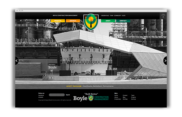
WEBSITE
