Perfect Partners
• BRAND IDENTITY • LOGO • TAGLINE • WEBSITE
The perfect name
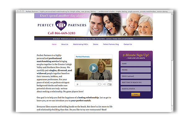
Perfect Partners named themselves. Way to go! With that fine inspiration, Sayre Design was commissioned to create a great logo to match — a “wowie” as the owner requested — and a good tagline to go with it, and then a new website to move the marketing effort into high gear.
P is for perfect, two Ps are for partners
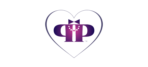
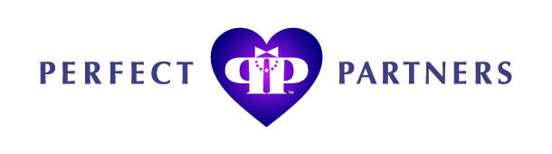
The symbol very cleverly incorporates reference to a string of pearls and a bowtie, suggesting male and female and the best of the dating experience. The back-to-back capital ‘P’s from Perfect Partners suggest two individuals as perfectly matched partners. The typography is clear and accessible, in nicely spaced capitals with thick-and-thin letterforms. Purple is regal and classy.
Have a heart
The heart shape came somewhat as a surprise since the designer declared early on in the project, “No hearts. No way!” After more consideration, though, the easy and appropriate charm of a heart image was revisited and when it also became apparent that the heart could serve as an effective containing shape for the other graphic elements, the designer had … well, a change of heart.
A nice match
This logo is very clean and well groomed, a nice exercise in economy and taste; reflecting what gives people confidence a matchmaking service. “Highly Personalized Matchmaking for Healthy, Long-Term Relationships,” as the new tagline says.
P.S. Visit their website to learn what it means to be put on “happy hold”. It’ll warm your heart.