McDermott Communications
• BRAND IDENTITY • LOGO • TAGLINE • WEBPAGE HEADER
Joe McDermott is a strong writer with a journalism background. He invariably finds the pith of his client’s story and crafts an efficient way to tell it. Sayre Design was commissioned to do something likewise, to create an extraordinary brand identity that communicates like him, like good writing. Clear, complete, to the point.
Black and white and read all over
The first design premise was to steer McDermott Communications back toward the crisp world of black and white (mostly), where words and letterforms are always at home, where good writing is always comfortable and feels germane. The red period is for zest and accent, a piquant little zinger for interest, a little snap-to off the page, like a memorable, well-turned phrase in Joe’s writing.
A not-so-secret code
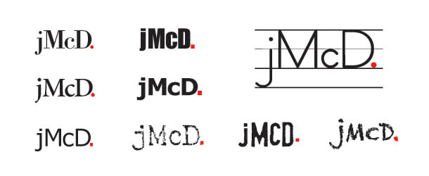
“jMcD.” is a statement. It is in fact a complete sentence, in code. It reads: Joe McDermott writes. Like this: Joe ( j ) McDermott ( McD ) writes. ( . )
Keystroke typography
The coolest thing of all about this brand identity is how ideally form follows function. McDermott’s brand identity is defined by the very means by which he delivers his work — keystrokes. It is as verbal as it is visual and vice versa.
There is no art element used as a logo here. And while we are using a particular typestyle (Myriad, because we like it), the “jMcD.” concept is not limited to it. This brand identity is defined by — in fact encoded within — a particular combination of keystrokes, which are available on any keyboard. It is rendered the same way as any other word on this page. Type lower case j, capital M, lower case c, capital D, period, and you have marked the brand — that simple and pure. If you can manage the period in red, so much the better!
We’re not even limited to computers in this regard. We can make the “jMcD.” brand mark on a typewriter, or even handwritten. At Sayre Design we call this keystroke typography. Words, letters, keystrokes. Perfect brand identity for a copywriter.
As a discrete entity, “jMcD.” both precedes and supercedes graphic design. The keystrokes themselves, not the font, determine how it looks. How it looks is purely contextual. It operates by way of word recognition, the fundamental basis for reading, the idea that a certain combination of letters means something. “jMcD.” falls neatly between the verbal and visual, having identity as both name and design. Pure brand identity.
As coded language the “jMcD.” brand identity is keyographic, we might say. Furthermore, “jMcD.” has twin virtues of highly recognizable text-stream visibility as well as speech-stream hearability (pronounced as “jay-mick-dee”). Hip, too!
But wait, there’s more!
“jMcD.” is extensible, too! Punctuation being both the prerogative and responsibility of the writer, meaning can be shifted rather smartly with deft punctuation. These alternatives ( . , ; : ? ! – ~ ) are also available right under our fingertips on any keyboard. Keystroke typography is as limited as language, but no more.

The tagline says what the logo says what the tagline says
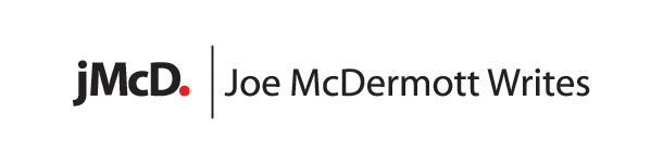
jMcD. | Joe McDermott Writes (complete brand message in keystroke typography)
Joe’s email signature works the same way:
jMcD. | Joe McDermott | McDermott Communications
1117 Webster Avenue, Allentown, PA 18103 | phone 484-860-2289
jysmcd@ptd.net | www.writerjoe.com | www.itsnotthatfar.com
Black and white and read all over … the internet
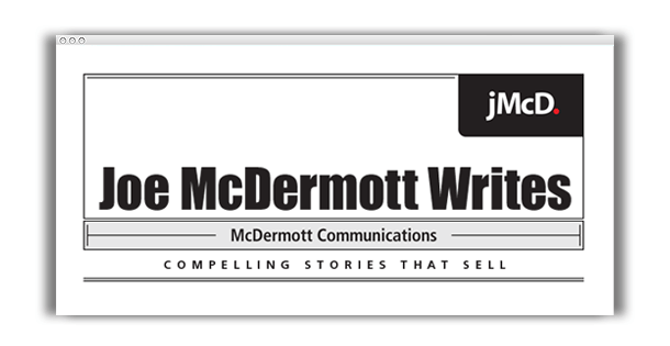
Sayre Design did not orchestrate the development and design of the McDermott Communications website, however, we did create this header graphic as a stylistic foundation for the “jMcD.” web presence (e-newsletters, website header, et.al.) to make sure that the brand is cyber smart.