J P Lamb Construction
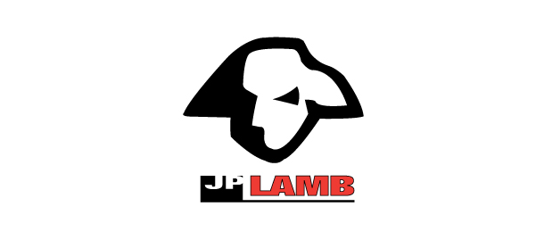
• NEW LOGO
J P Lamb Construction had a problem. The connotations of the word ‘lamb’ do not easily associate with the rugged business of construction.
A rebus (a picture literally representing a word) is normally a golden opportunity for brand identity design, but in this case was a special challenge because of the seeming incongruity.
The eventual success of the strong lamb-as-ox rendering was actually born of earlier frustration expressed as a rough pencil sketch which the designer just happened to casually share with the owner, who then declared, “There it is! That’s what we’re looking for: a lamb as strong as an ox.” The rest is history, as they say. The striking solution was evidently worth the struggle.