Galt Energy
• BRAND IDENTITY • LOGO • MODIFIED NAME • TAGLINE • WEBSITE
THE COMMISSION
Galt Energy is an energy broker, one of a new breed of businesses taking advantage of government deregulation. Their quickly-expanding company offers a level of professionalism and a consultative dimension that separates them from the run-of-the-mill sellers of electricity.
When Galt Energy commissioned Sayre Design to create their new brand identity, they had two requirements: (1) a mark that they could not outgrow, and (2) to look like they belong on the same playing field with Fortune 10 energy companies.
THE NAME
The original name, The Galt Company, LLC, was indistinct and unfocused. We generated impact and clarified their purpose by modifying the name to Galt Energy. The new name creates two types of clarity: the moniker is now liberated to place easy emphasis on ‘Galt’, and the descriptor (Energy) truly describes the work of the company.
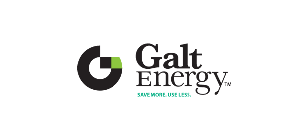
THE LOGO

The mark: Having clarified the name, we set to the visual task. Focusing on the G, we took advantage of the convenient opportunities it offers. The pure geometry of the circle establishes a presumption of balance, wholeness, legitimacy. We then turned to the concept of the grid, which is very germane to an understanding of the electricity industry, and allowed it to enter and overlap the circle. When the circular and grid elements intersected, the stylized G began to emerge. With some tweaks and refinements, we had a finished graphic obeying one of the supreme maxims of design: simpler is better.

The typography: We chose a serif font for a less-obvious expression of business stature. The new Galt ‘G’ symbol, itself, has much of the character of a bold, sans serif font—which would otherwise have been a good choice for the basic logotype. However, with that base covered, we were able to get a certain smart, articulate quality, and even more connotation of credibility, out of a well-chosen serif font.
The serif font also makes a much clearer distinction between the ‘l’ and ‘t’ in Galt. For many sans serif fonts, ‘l’s and ‘t’s are confusing at a glance, especially when they are right next to each other. But a serif ‘t’, in particular, separates and defines itself next to the ‘l’. Even though Galt is only four letters, in a serif font Galt has no problem being read.
The difference in type weight of the serif font helps emphasize the moniker (Galt) in bolder weight than the descriptor (Energy). However, we wanted to de-emphasize ‘Energy’ even further, to keep it in proper proportion to ‘Galt.’ All lowercase would have gone too far, so we drew a custom capital E exactly to specification to properly fit the lower case of that font. A small matter, perhaps, but as in the energy business, it is often the last mile that matters most.
The colors: Electricity is colorless. However, we chose a pair of greens that, between them, send an alternating current of cool, calm, comfort (blue-green) and an edgy, restless sort of energy (yellow-green). The yellow-green is more volatile and able to be associated with the idea of energy. The blue-green is a cool, calm, stable counterpart, suggesting similar business virtues.
THE TAGLINE
The tagline “Save more. Use less.” is a succinct, efficient way of laying down the two fundamental aspects of Galt Energy’s business: brokering electricity and helping customers manage energy consumption. It also gives us the formula for their homepage layout and marketing message.
THE WEBSITE
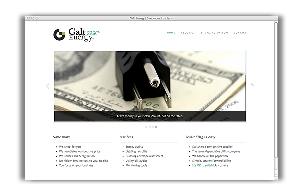
With Galt Energy’s new brand identity in hand, we had a very short window of time in which to design and go live with their website. The home page, especially, had to arrest the visitor’s attention and move him/her to a decision the moment they recognize that energy deregulation holds opportunity, and Galt Energy can help them make the most of it.
We melded interest and information, keeping the site tidy and succinct. Though modest in scope, it is purposeful and expandable. Page design, image, and typography choices all are consistent with, and extend, the Galt brand identity. In this context, the simple, clean color scheme has connotations of trustworthiness, safety, and the promise of something better. White suggests unraveled complications, making a complex subject easier to understand. In a tough-sell industry, where people can be skeptical or even suspicious, we are bringing down that barrier and easing the sales process by allowing Galt Energy to look like they belong on the same playing field as the utility companies, themselves.
BEFORE AND AFTER
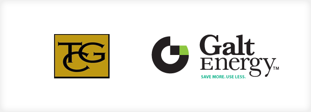
In the original logo, the initials TGC are stacked and confusingly ordered in a way that is counterproductive. Because all three letterforms have equal weight and styling, equal emphasis is placed on all three words. When one discovers that the T and C stand for ‘The’ and ‘Company,’ not much meaning is delivered.
Now, Galt Energy has a name and logo that performs as well as the energy industry leaders, providing all of the benefit of the doubt that comes with that association.