Emmaus Main Street Partners
• BRAND IDENTITY • LOGO • REFINED NAME • TAGLINE
THE COMMISSION
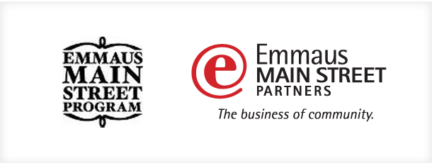
This lively civic organization, The Emmaus Main Street Program, wished to solidify its position in the community with a name change and a fresh look. Associated with the national Main Street Program, the marketing committee had considered changing its name to ‘Emmaus Main Street Partnership’ as a better expression of its true function and value to the community. Sayre Design was hired to create a new logo.
THE NAME
The first thing we accomplished was to expand upon the committee’s thinking about their name by suggesting that they shorten ‘Partnership” to ‘Partners’. The ‘Aha!’ moment came as a delight to everyone.
THE LOGO
Having resolved the name, we returned to the logo design assignment.
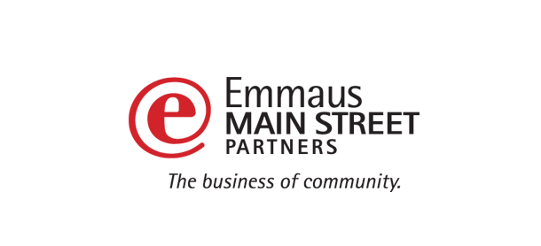
The mark: After interviews, research, and much consideration, we recognized relevance as one of the cardinal characteristics that this organization wished to communicate going forward. we noticed a pattern in the language of people describing the wonderful things that happen “at Emmaus”. Combining ideas about cyber- and business-communication with the organization’s role in economic development, we thought of the @ symbol derived from email signature syntax. That, in turn, led us to produce what came to be called the ‘eeyat’. The ‘eeyat’ effectively merges ‘e’ for Emmaus with the @ symbol. Having struck this interesting note, which is by equal turns provocative, contemporary, and solidly based in modern communications style, we thought was spot-on with what this organization wished to achieve at it recast its brand.

Various signatures:
The ‘eeyat’ has several siblings, that are equally viable alternative logo variations: the ‘eedot’, which casts the ‘eeyat’ in a strong circle background, and the ‘ee-mmaus’ which literally substitutes the ‘eeyat’ for the ‘e’ in Emmaus.

THE TAGLINE
We tried to bring together the two aspects of what they do into a single, succinct statement, memorable and to the point. “The business of community.” The period at the end of the tagline encourages the reader to provide emphasis, either on the word business or community. It works equally well either way.
BEFORE AND AFTER