DesignPoint Interiors
BRAND IDENTITY • LOGO • MODIFIED TAGLINE • WEBSITE
THE COMMISSION
DesignPoint is a well-established and successful commercial interior design firm which is looking to stay that way. While seeking help updating their website, they discovered it was time to entirely rethink their brand. It became important for their image to be fresh, engaging, and relevant—qualities they recommend for their clients’ interiors.
With their recast branding, DesignPoint is positioned to pursue their strategy of expanding into newer, larger, and more sophisticated markets.
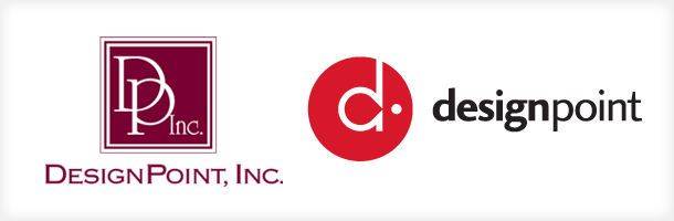
Symbol

As with good interior space planning, the new mark (which we named the d-pointe) is based firmly on tried-and-true geometric principles. The d-pointe is based on two perfect geometrical figures: the circle and the golden rectangle. Perfect geometric forms, like all those based on the golden ratio, have been traditional favorites of interior designers, architects, and graphic designers. The lowercase ‘d’ within the logo, the position of the floating dot, and the position of both elements together with relation to the circle, are all governed by the same mathematical principle and thereby achieve harmony.
Logotype
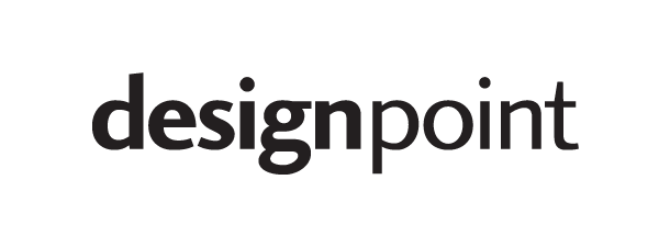
The logotype is based on a well-chosen font that feels equally contemporary and traditional—not unlike DesignPoint’s interior designs. Note, for instance, the distinctive look of the lower-case ‘t.’ We spelled the name in lower case to achieve a more contemporary and approachable feel, and distinguished the component word parts by a simple change in type weight. The result is crisp and stylish, readable and memorable.
Before and After
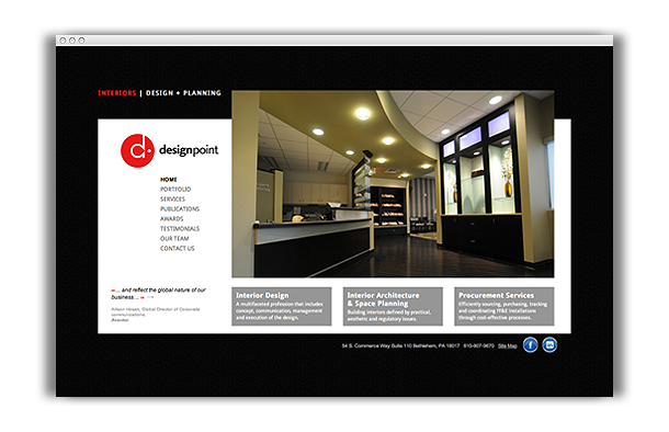
Website
Logo Love
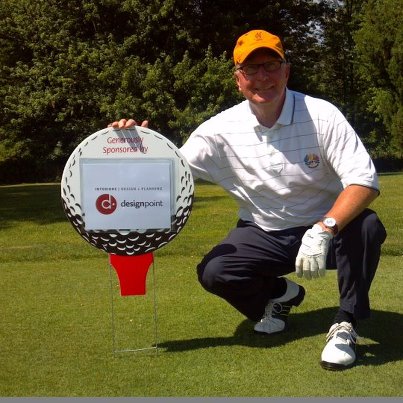
Golf Sponsorship – Les McCoy
First public appearance: Les McCoy, president of DesignPoint, introducing his new brand on the DesignPoint-sponsored green.