Ballan and Sons Bakery
• BRAND IDENTITY • LOGO • WEBSITE
THE COMMISSION
The Ballan family came to Sayre Design for help in branding their new Middle Eastern bakery. Since Ballan and Sons is an ethnic bakery, we leveraged their Lebanese heritage, allowing it to influence the look and behavior of the brand fresh out of the oven, so to speak. The new brand gives a strong initial impression of experience and authenticity, communicates across all marketing channels, and extends to signage and packaging.
THE LOGO
![]()
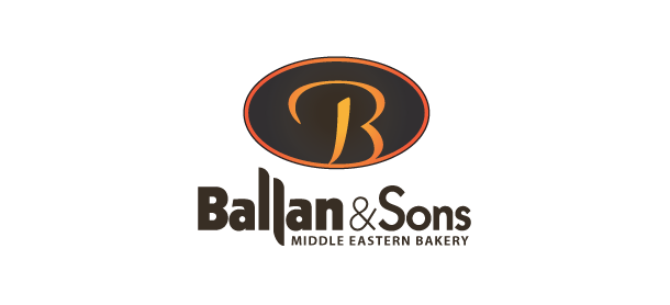
The new mark derives its basic character from the expressiveness of Arabic calligraphy. It suited our purpose that the script form of the English capital ‘B’ shares many characteristics with Arabic letterform. The mark is easily read as a ‘B,’ but it also has a pleasing gestural sort of abstraction.
The oval surrounding the letterform conveniently reminds us of pita bread, the bakery’s first product.
The color palette was chosen to evoke the warmth of the traditional Middle Eastern brick oven. Yellow, orange and red are the colors of heat.
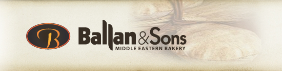
The context in which the logo is set is largely concerned with color and texture—warm and ‘bready.’ Light fields are reminiscent of unbleached flour and baking parchment; dark fields are a pleasant crusty brown. Type colors, pale yellow and light orange, suggest the warmth of a hearth.
The typography: The concept for the Ballan typography follows on two axes. The first axis is geographical: the West and Middle East. The second axis is temporal: traditional and contemporary. The font, as modified, represents all four points of those two axes.
The basic sans-serif typestyle lends a contemporary sense, while retaining old-style characteristics such as a small x-height and a more formal lower-case ‘a’. That sans-serif font basis, which is contemporary and Western-leaning, was then turned in a Middle Eastern direction by small but important finishing details like extended letters and curved terminals. The result was reminiscent of Arabic script, as with the Ballan ‘B.’
THE WEBSITE
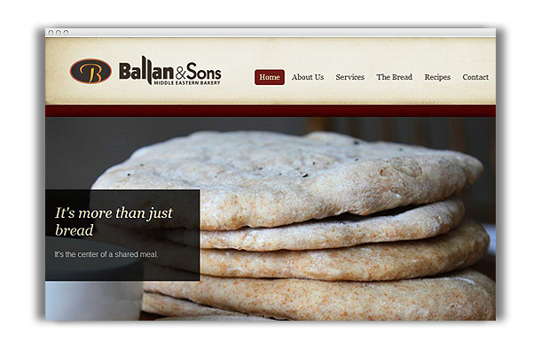
The Ballan & Sons Middle Eastern Bakery website is characterized by the generous use of carefully-chosen photos of pita bread and quality foods. The visitor is invited in a very persuasive way to come under the influence of the good taste and appeal of this bakery and its traditional quality products. In a few simple pages, their story is told and essential information communicated in a way that remains consistent with the new branding.