Ashton Funeral Home
• BRAND IDENTITY • LOGO • TAGLINE • WEBSITE
Brand Identity
The Ashton Funeral Home is one of the oldest, continuously operated, family-owned funeral homes in America. In business since 1847, over five generations of Ashtons have served the Easton community. They commissioned Sayre Design to update their company image and establish a web presence in their market, in which the family has a very high profile. In an increasingly competitive field, they needed a more consistent marketing message.
We retired the old Ashton look, which was not adequately expressing the wealth and richness of their heritage, and therefore not leveraging a marketing advantage to which they were rightfully entitled. There was a lot of capital being wasted.
Our challenge was how to update an identity for whom its very age is a main feature—how to update something old, wherein being old is an asset.
Curiously, the whole effort turned on the design of the logotype. We chose a font that was just old enough to secure a foot in the past, yet appear new. A product of the Edwardian era, the font was modern about a century ago and is now enjoying a retrospective revival. It comes from a convenient midway point in Ashton’s history—as if to literally straddle old and new by striking a midway posture. So it looks new all over again, coming to the present without having lost its age, creating an impression that is both fresh and venerable. It elegantly parallels our assignment for the identity of the Ashton Funeral Home—to create something fresh and new, whose asset is its age reference.
All of the aesthetic decisions, including the color palette, were made with a conservative bias, befitting the pedigree and strong conservative leaning of this five-generation-strong funeral home.
Although our task was to update the Ashton brand, we were conscious of also honoring the Ashton family itself. They are marked by strength, professionalism, and great dignity, while remaining very warm and approachable. Their new mark successfully reflects them in this way.
Sayre Design created a brand identity vocabulary of several elements: a typographic logotype, an emblem, a symbol-and-type signature, and a horse-drawn hearse silhouette graphic.
Ashton A
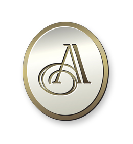
The Ashton “A”, the basis of the emblem, is a custom hand-drawn calligraphic letter which straddles the line between the venerable past and fresh present. It makes curious use of an old flourish in a modern way. At first glance, it seems old, and is therefore grounded correctly in the past. But the more you study it, the more modern, or less old, it feels.
Horse-Drawn Hearse
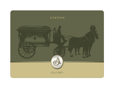
This graphic is, in fact, an original and accurate rendering of the antique horse-drawn hearse still owned by the Ashton family.
Website
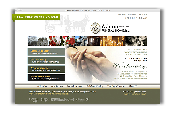
The challenge here was to present a complex subject with far-reaching implications in an elegant and easily-navigated way. Funeral home website visitors have various needs, from planning to meeting an immediate need.
The overarching design concept was to advance the Ashton identity by using aesthetic principles of beauty, proportion, and the joy of discovery. All of the copywriting is original and stems from our observation of the deep experience and great care with which the Ashton family treats its community. The achievement of the website is a harmonious blend of ample information, concise writing, pertinent detail, and a sense of moral support. It features a custom-designed obituary section which allows mourners to leave comments that will remain on the website indefinitely. As a package, it carries forth the Ashton brand identity in a way that reflects the wonderful qualities of this business family.
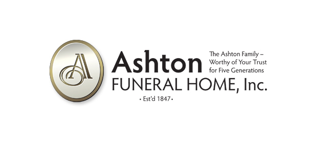
Horizontal Logo
![]()
Here is the fully integrated Ashton Funeral Home logo signature, in its horizontal form.
CSS Praise
Ashton Funeral Home can be showcased at CSS Garden.
![]()